Blog
The Role of Data Visualization in Political Decision-Making
In today’s data-rich world, political decision-making is no longer driven solely by intuition, rhetoric, or isolated reports. Governments, policymakers, and institutions increasingly rely on data visualization to interpret complex information, identify patterns, and make informed decisions that affect millions of people.
Data visualization serves as the bridge between raw data and actionable insight — transforming numbers into clarity.
Why Data Alone Is Not Enough
Political and governance data often comes in massive volumes: voter registration figures, election results, budget allocations, demographic trends, service delivery metrics, and public opinion data. While this data is valuable, it can be overwhelming without proper interpretation.
Tables and spreadsheets may store information, but they rarely communicate meaning effectively to decision-makers under time pressure. This is where visualization becomes essential.
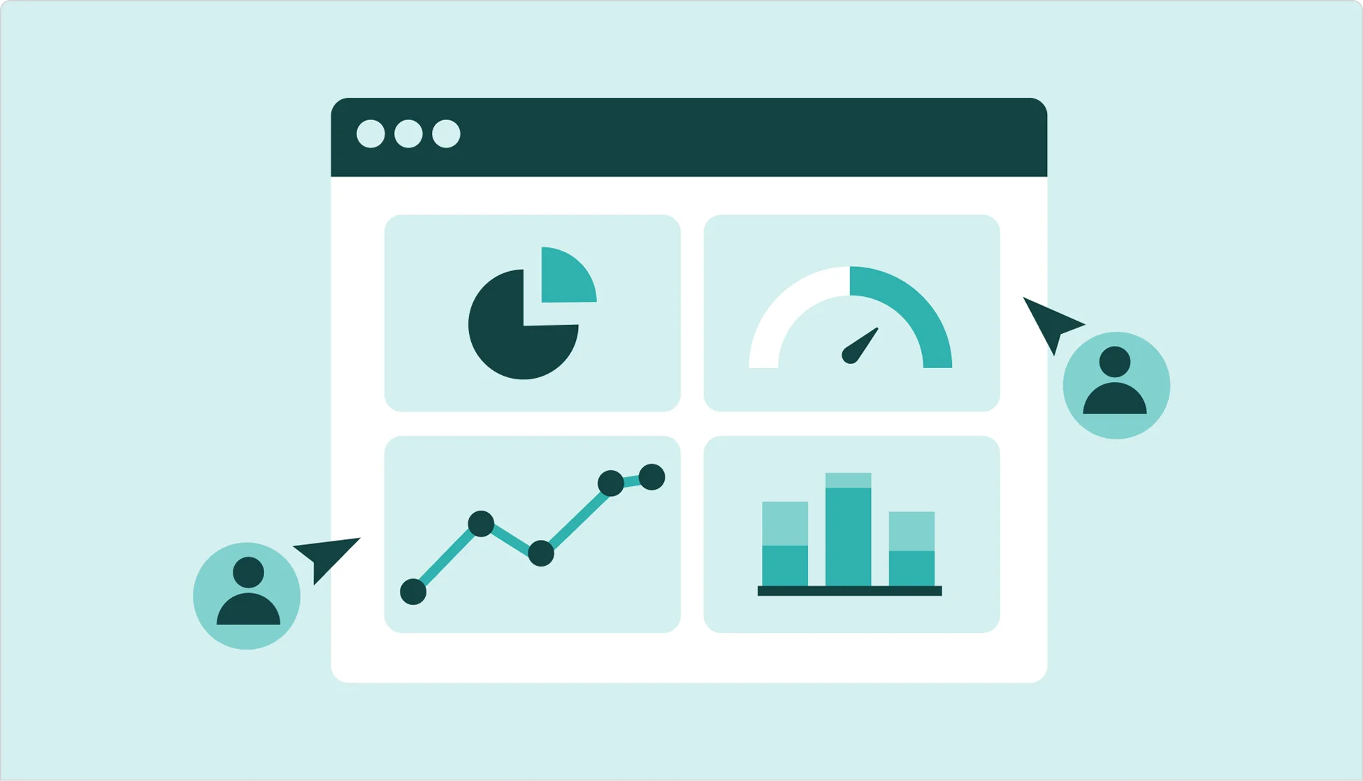
Making Complex Information Understandable
Data visualization simplifies complexity by presenting information in visual formats such as maps, charts, dashboards, and graphs. These visuals help political leaders and analysts:
- Quickly grasp trends and anomalies
- Compare regions, time periods, or demographics
- Identify relationships that are not immediately obvious in raw data
For example, a heat map showing voter turnout across regions can reveal participation gaps more clearly than pages of numerical data.
Supporting Evidence-Based Policy Decisions
Effective political decisions require evidence. Data visualization enables policymakers to base decisions on facts rather than assumptions.
By visualizing data on issues such as healthcare access, education outcomes, infrastructure distribution, or security incidents, leaders can:
- Prioritize interventions
- Allocate resources more fairly
- Evaluate the potential impact of policy choices
Visual tools help ensure that decisions are guided by reality on the ground.
Enhancing Transparency and Accountability
Clear visual representation of data also plays a critical role in transparency. When citizens, civil society organizations, and oversight bodies can easily understand government data, trust is strengthened.
Public dashboards and visual reports can:
- Communicate policy performance
- Track progress against stated goals
- Reduce misinformation and misinterpretation
Transparency supported by visualization fosters accountability and informed public discourse.
The Power of Geospatial Visualization
In political and governance contexts, location matters. Geospatial data visualization — such as maps and spatial dashboards — provides insights that traditional charts cannot.
Geospatial visualization helps decision-makers:
- Understand regional disparities
- Monitor election logistics and turnout patterns
- Plan infrastructure and service delivery
- Respond more effectively to crises and emergencies
By linking data to geography, policymakers gain a more holistic understanding of societal challenges.
Real-Time Insights for Timely Decisions
Modern data visualization platforms allow for real-time or near real-time updates. This is particularly valuable during elections, emergencies, or rapidly evolving political situations.
Real-time dashboards support:
- Faster response times
- Improved coordination among agencies
- Better situational awareness
Timely insight often makes the difference between reactive and proactive governance.
Challenges and Responsible Use
While data visualization is powerful, it must be used responsibly. Poorly designed visuals, incomplete data, or misleading representations can distort understanding rather than improve it.
Best practices include:
- Using accurate and verified data sources
- Choosing appropriate visual formats
- Providing context and explanations
- Avoiding oversimplification of complex issues
Responsible visualization supports clarity, not confusion.
Looking Forward
As political systems become more data-driven, the role of data visualization will continue to grow. When used thoughtfully, it empowers leaders to make informed decisions, strengthens institutional transparency, and enhances democratic processes.
Ultimately, data visualization is not just a technical tool — it is a decision-making asset that turns information into insight and insight into action.